For organisations and entities, a brand functions as a calling card. Your audience needs to be immediately captured and intrigued by your visual identity, and your brand needs to convey your values and purpose in a way that makes people want to know more about it.
That becomes even more important when your newly created organisation is setting itself out to be a driver of change and a circular economy actor.
How do we create a brand that clearly conveys our mission and vision, but isn’t like every other “green brand” out there?
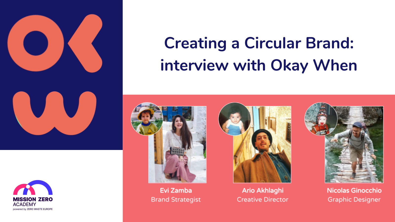
We (virtually) sat down with Okay When, the creative agency behind the MiZA and Zero Waste Cities Certification branding and visual identities, to discuss the challenges of creating a “green brand” and get more insights into their creation process.
What interested you in the Mission Zero Academy (MiZA) branding project, and ultimately led you to submit a proposal to collaborate with us?
We are suckers for good causes! So the main reason for submitting a proposal was the actual mission of Zero Waste Europe and it’s child, Mission Zero Academy. Our clientele includes various actors in the environmental fight – such as activist organisations, global alliances, NGOs, EU Institutions and political groups at the European Parliament etc. – so we are familiar with the positive impact of the circular economy.
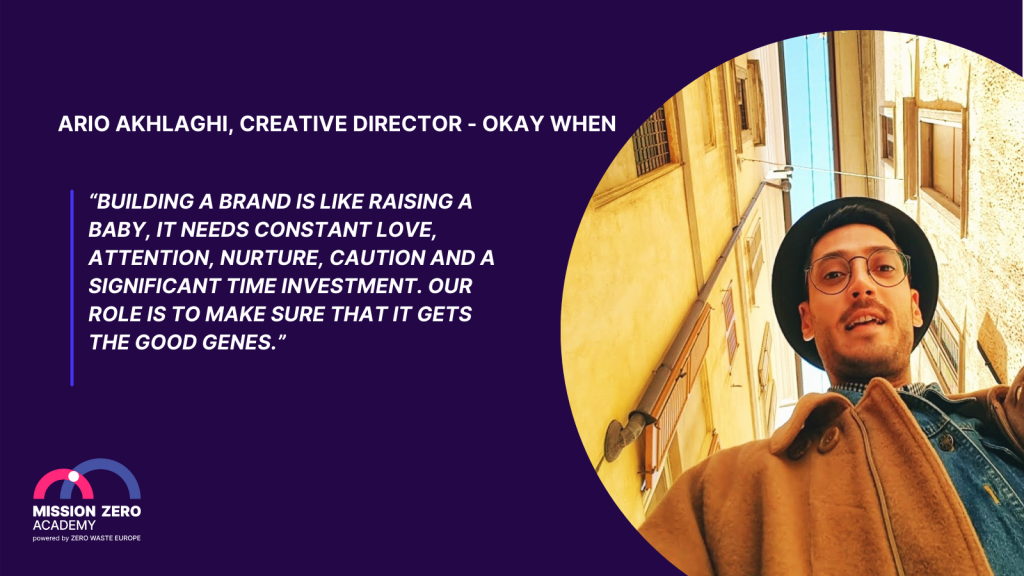
We also get excited when we get to work on a brand-new brand, like MiZA. This is a chance to do everything right from the start – build strong foundations and scalable features that can handle a healthy growth – and therefore make the client’s life easier in the future.
Which brings us to the next big plus. These guys (as in, ZWE and MiZA) dream big and we love to work with ambitious people and brands. The fact that MiZA is a pan-European project, and has had such a large scope from Day 1, is thrilling! Challenging in terms of communications, but thrilling nonetheless.
So we applied… and here’s when the fun part begins!
Indeed! Tell us a bit about your process behind branding and visual identity development – what are the steps that lead to the creation of an appealing brand?
The information we need to gather includes the brand’s purpose, vision, mission, values and promise(s). In addition, we need to determine its positioning regarding its competitors, and therefore its unique selling point. Finally, we need to discover its target audience – the whole target audience, which usually is much bigger than the client thinks it is.
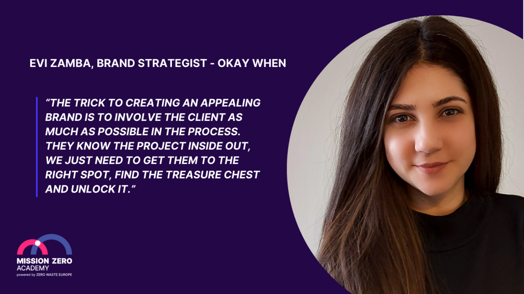
How do we find that out? We begin with an anonymous brand discovery questionnaire – to get an idea of what the brand is about and the level of the team’s understanding of Communications. Then, we met everyone during an interactive (and fun) 2-3 hour Brand Strategy Workshop with the ZWE/MiZA team to fully understand the intentions of the brand and the complexity of the project. And finally, we conclude this process by sending some homework exercises to the client team, so we can get all the details right.
From all these insights we create a meaningful Brand Strategy and an accurate Brand Persona. In MiZA’s case, it’s Alex. Alex is gonna do great things, you’ll see that for yourself!
The final steps of the process are:
- Brainstorming… Brainstorming… Brainstorming…
- Experimenting… Experimenting… Experimenting…
- We play around with graphic elements, shapes, letters, colour combos, animations and come up with a bunch of ideas. Then we narrow down these ideas and present two creative concepts to the client.
- The client chooses one option and we develop it further, into a concrete Visual Identity!
So, once you received the initial briefing from MiZA and had the first meeting with the team to start developing the branding, what were the main challenges identified?
We faced two main challenges in MiZA’s case.
The first challenge was understanding MiZA’s niche market. Zero waste is a topic that is still seen as very new and perplexing; the B2B business model needs to reflect the technical side of it; and, MiZA being an online academy, there is a need to inspire the audience to join a process that is novel and remote.
The second challenge resulted from solving the first one. After consulting the ZWE team, we ended up with 12 different client profiles, a.k.a. audience personas. These are detailed descriptions of fictional characters who represent your target audience. And the reason for creating these is to figure out what kind of problem you can solve in your audience’s lives. MiZA’s audience spans across multiple age groups, industries, job positions, budget levels, knowledge levels, and more. So we had to build a brand that all these people will trust with their dreams and careers.
Can you tell our readers a bit of the rationale behind the MiZA logo?
The concept we based the Visual Identity of MiZA on, is reflected in the logo. The logo combines three layers of symbolism.
The basis includes a hint of the first letter of the brand name “m”. The second layer adds “a bridge” in order to show the strong foundation, the supportive nature and the transfer of knowledge that characterise MiZA. The final layer, “the connecting dot” represents the exchange of information and the constructive interactions between multiple players throughout the journey to reach a zero waste mentality.
The colour palette also adds to the sense of ambition, inclusivity, honesty, and credibility that characterise MiZA. The primary colours of the logo are Magenta and Royal Blue. When optimism and openness are mixed with trustworthiness and reliability, this is the result. One side of the image is lively, warm and elegant; and the other is calm, stable and strong. Despite the contrast in sentiment, this image does not hit the two extremes, it instead remains balanced and easy on the eye. At the same time, it manages to be powerful and impactful. Like two partners that bring out the best in each other, this combo creates a sense of enduring intensity and is loud enough to be a showstopper.
And a showstopper it is, indeed! What about the Zero Waste Cities Certification logo?
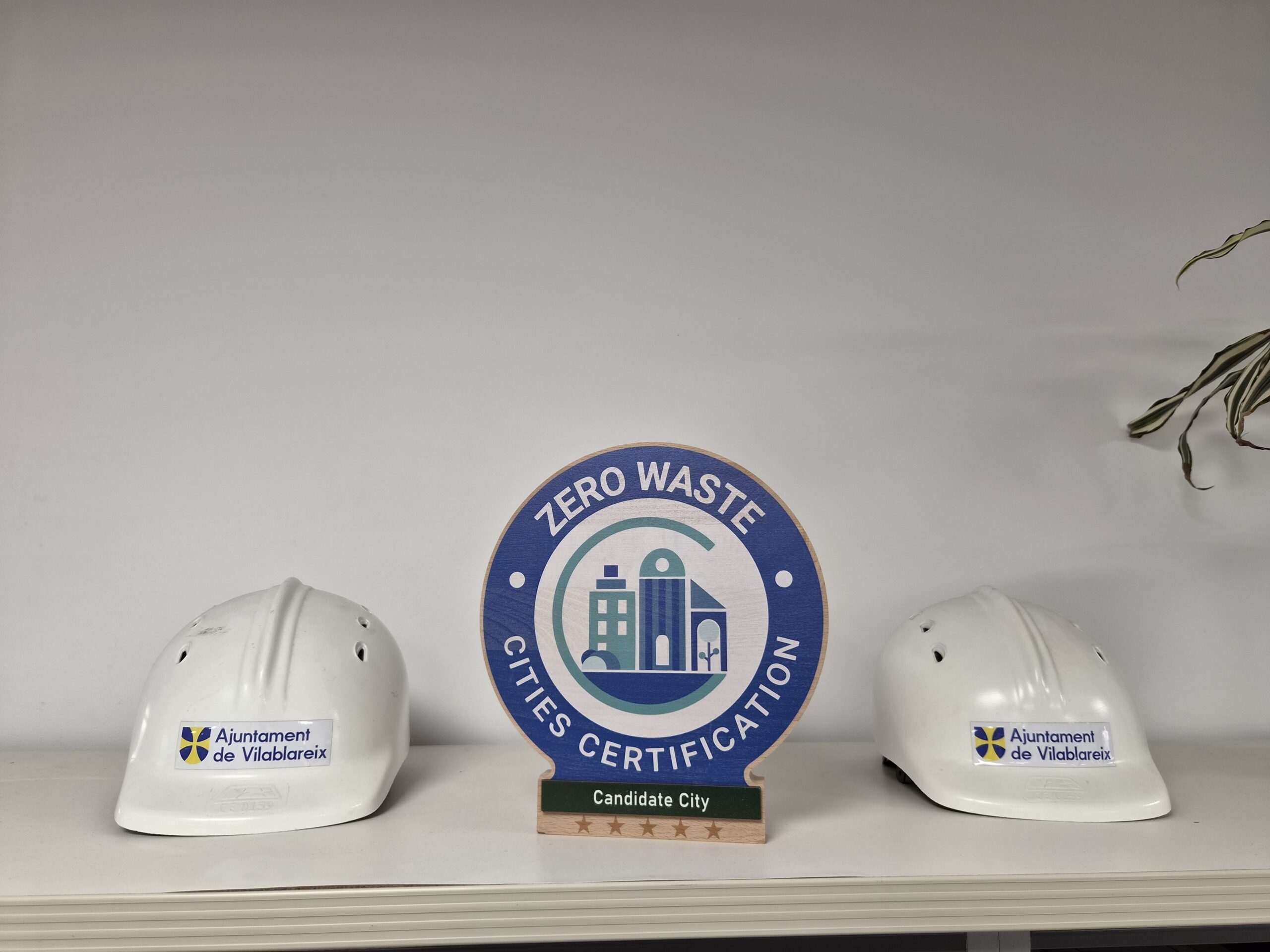
The Zero Waste Cities Certification logo had very specific requirements we had to follow, which took the project to “difficulty level: 100”. We needed to incorporate both the Zero Waste Europe brand and the MiZA brand in the Certification logo. On top of that, the logo included multiple variations which translated to hundreds of logos being developed to reflect the various levels of candidates (vertical expansion). Finally, the logo needed to be designed for scalability, so that it can be changed to apply to other industries (horizontal expansion).
In the process of developing the logos, we tested different colours, fonts, shapes in order to create the associations and still keep the base minimal and self-explanatory. The logo is made up of three elements. The letter “c” stands for the concepts most related to the brand: “Cities”, “Certification” and “Circular economy”. The “buildings” represent a modern European city with a successful circular economy that all candidate cities aspire to become. The final element is the “green aspect” (trees and bushes), which illustrates some key priorities of the certification.
A circle with the title surrounds the main logo and a base is added to the bottom part to describe whether the city is a candidate or certified. Then stars (up to 5) are added under the base in order to illustrate the level of completion in an intuitive way. The colour palette includes Zero Waste Europe’s colours (used for the logo) and 2 colours from MiZA’s palette (used for the base under the logo).
One final question: how can branding help circular entities better convey their messages and goals, and improve their reputation?
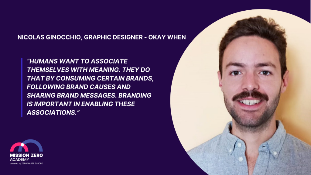
An appealing brand image, through a clear visual identity, simple and catchy messages and a unique tone-of-voice, is key in this pursuit. A circular entity can create a loyal and loud fan base by investing in branding. Noble causes, like fighting for a successful circular economy, are easy to sell since they can only create a positive impact. Isn’t it a shame not to communicate it as best as you can?
You can check out Okay When on their website, instagram or LinkedIn.